

Pelle Skincare
BRAND IDENTITY – ART DIRECTION – PACKAGE DESIGN
Starting the year off right with a fun personal project - a fictional skincare brand!
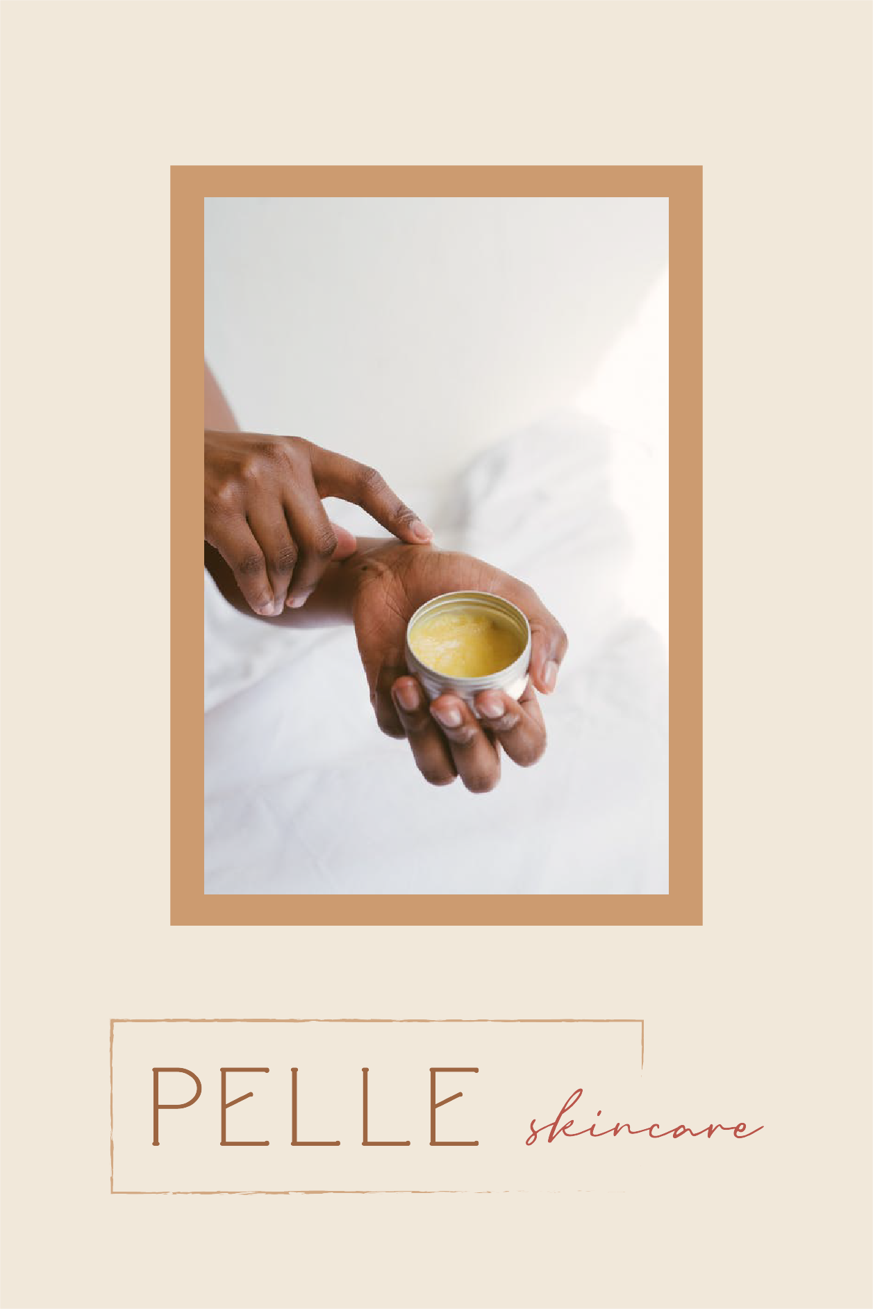
This design was inspired by my deep heritage in Italy and the long & rich lives of the people who live there. Quality, tradition, natural ingredients, and old skincare regimes all come together to form Pelle Skincare.
The minimalist, no-fuss design is reminiscent of famiglia in Italy - old families, upholding tradition, with no frills. The logo is designed to fit on multiple packaging types, as well as work beautifully as an overlay for imagery and on social media.
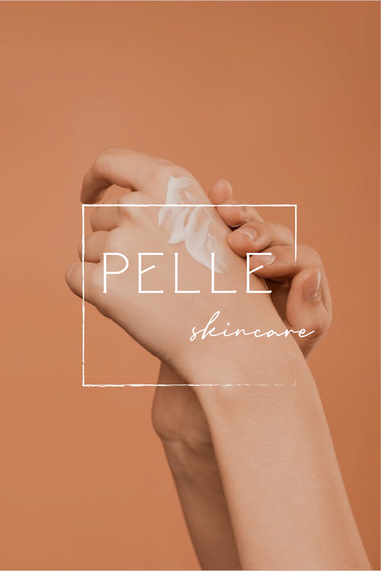
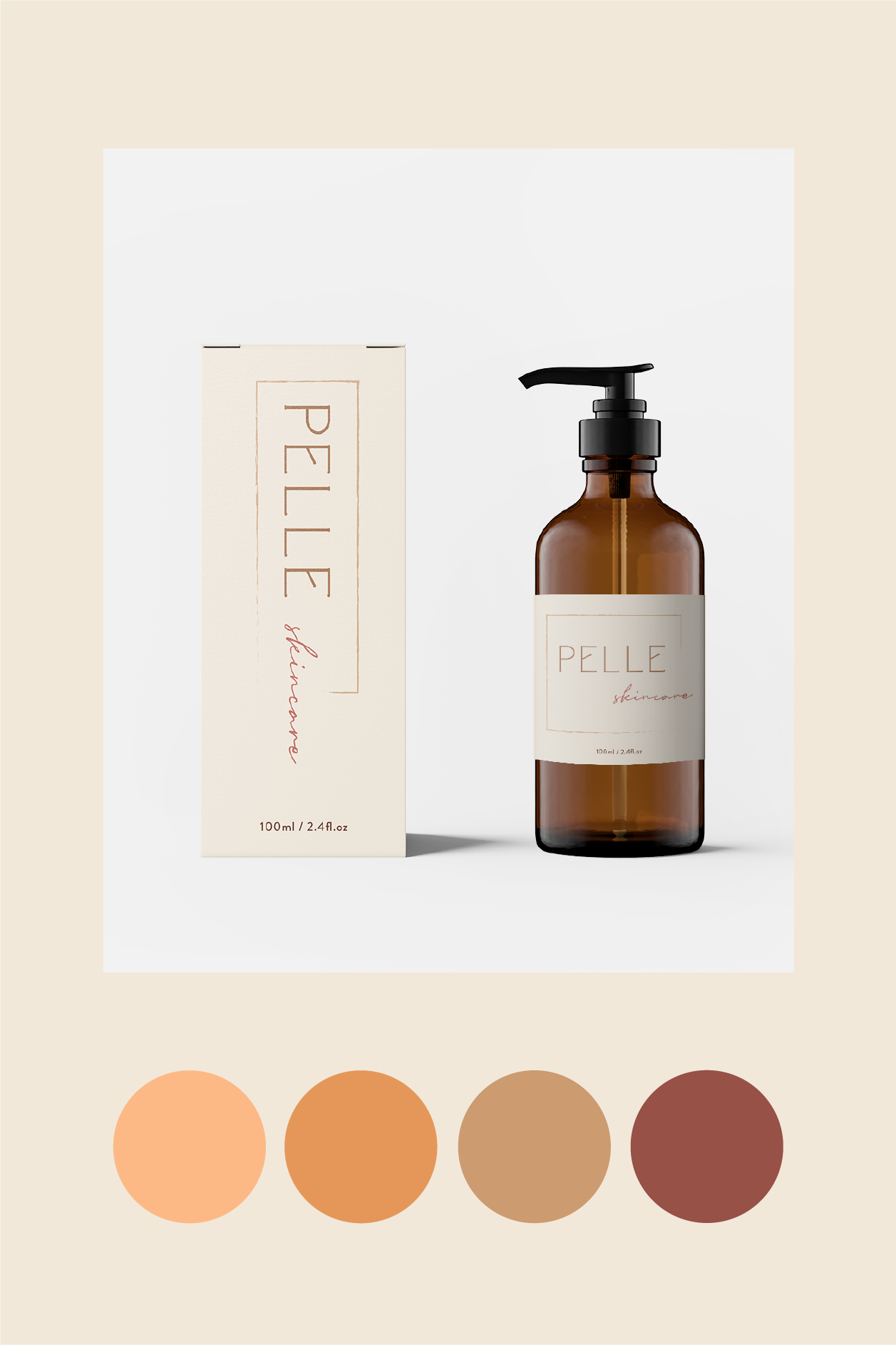
The simple lines and colors with just a hint of outside-the-box thinking (note the custom type for 'pelle') bring something special to the design. I chose warm shades for the color palette, to evoke femininity and stability - the repetitive daily routines that keep us grounded. The clean lines reflect the care and attention given to our skin.
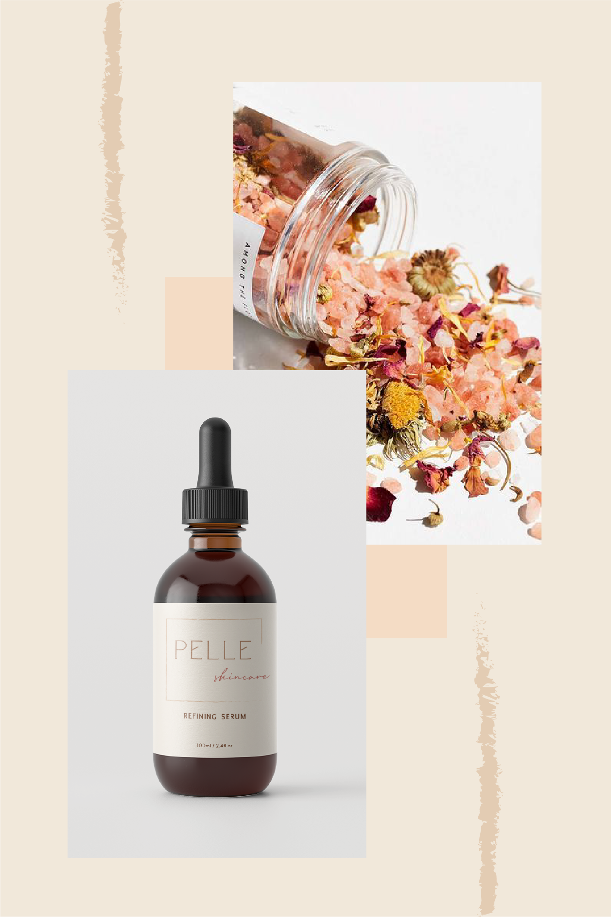
The soothing creams and refreshing serums are packaged with care, and create a look that’s instantly recognizable in both the beauty aisles and online. Pelle Skincare will stand the tests of time with its classic yet fresh design.

Looking for a unique brand design that will bring your product to life? My goal is to give you confidence in your business, secure in the knowledge that your brand will be able to compete.