5 Logo Trends to Avoid
Hey, it’s me, your favorite anti-advice-giver. (Is that a thing? Like anti-hero?).
Today’s topic is about logos and logo trends, and I KNOW some of these are going to hit a little different. Let’s go into this with the reminder that we are all different, different brands require different styles, and in the end it depends on your brand and brand designer. Here we go!
If you’re thinking of investing in a brand this year OR rebranding, here are a few logo trends it might be best to avoid!
Keep in mind that every brand is different, and some of these trends may be what works best for your brand, but they are trends that ultimately are repeated over and over. Don’t settle!
Furthermore, all of these are subjective, meaning that each trend can be used effectively.
My goal here is to showcase the fact that there are indeed design trends that come & go, and to encourage you to think outside the box and remain focused on your brand vision without being influenced by others’ designs. This isn’t meant to be an attack on these logos or palettes or styles, just a call to reconsider following the next hot design!
Now that I’ve caveat’d myself till I’m blue in the face (hello crippling fear of conflict), let’s dive in.
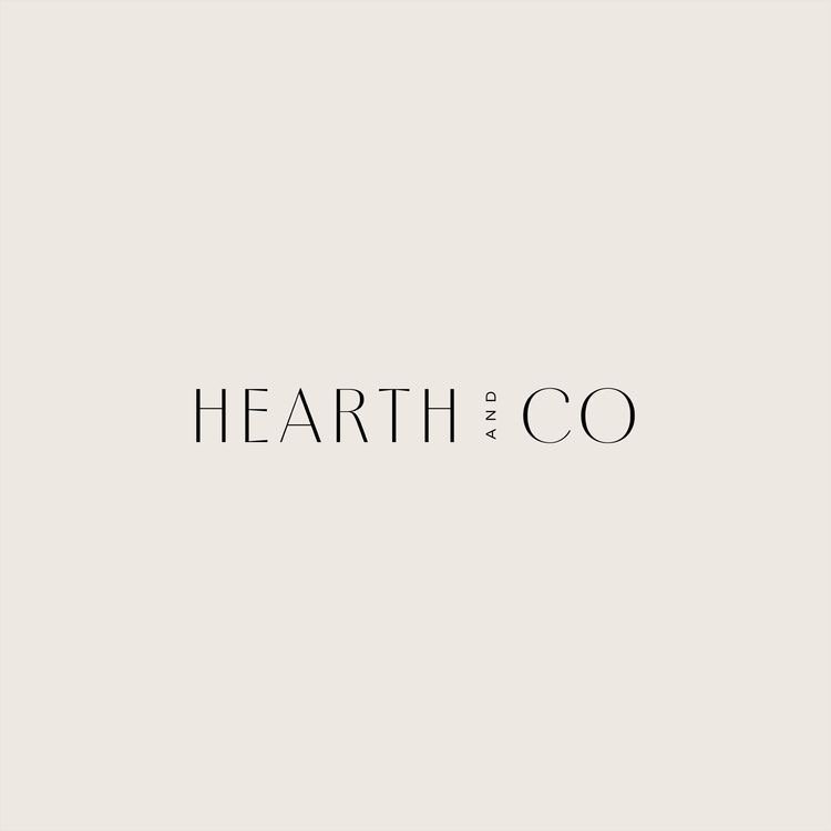
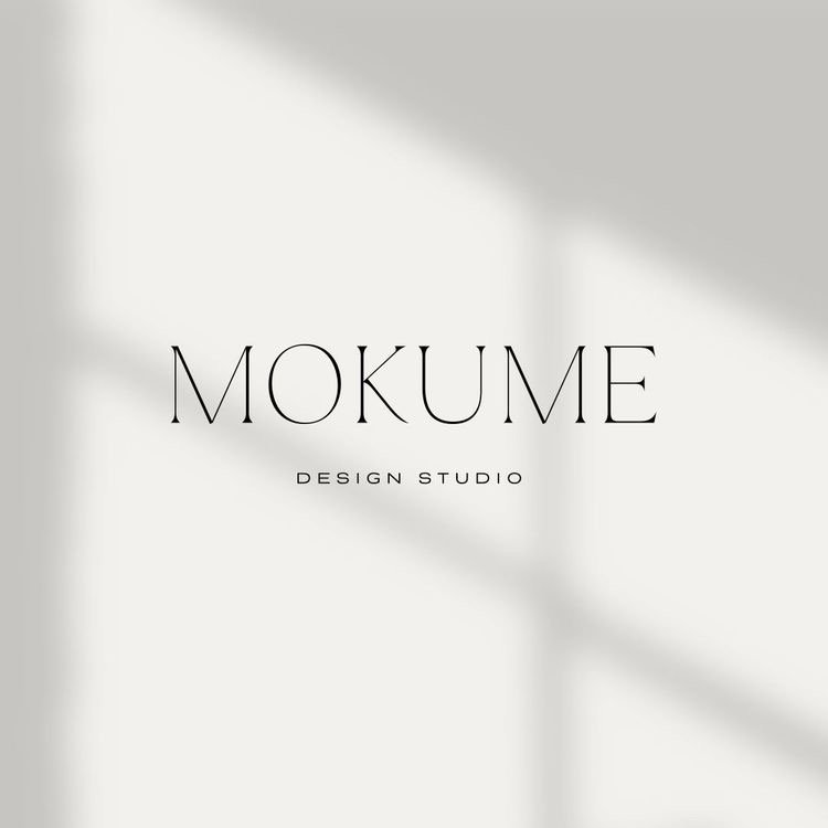
Trend #1: Ultra-skinny fonts
Don’t disown me! These look clean and are very visually appealing, but they can be extremely difficult to read on packaging, signage, or other marketing materials if you decide to go this route. If you like this style, I encourage you to have an in-depth talk with your brand designer about this approach, and make sure your logo will be legible (and that this trend is appropriate for your brand overall).

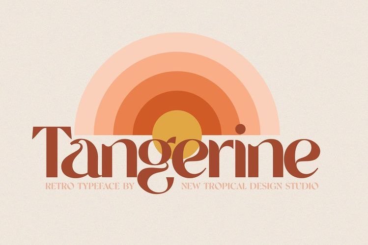
Trend #2: 70’s style fonts
Okay, okay, I admit it: this is such a cool trend. But unless you really think it will vibe with your clients, don’t do it. I see these fonts allllllll the time, especially for businesses that aren’t even remotely aesthetically or missionally-related to this style of font. Again, talk it through!
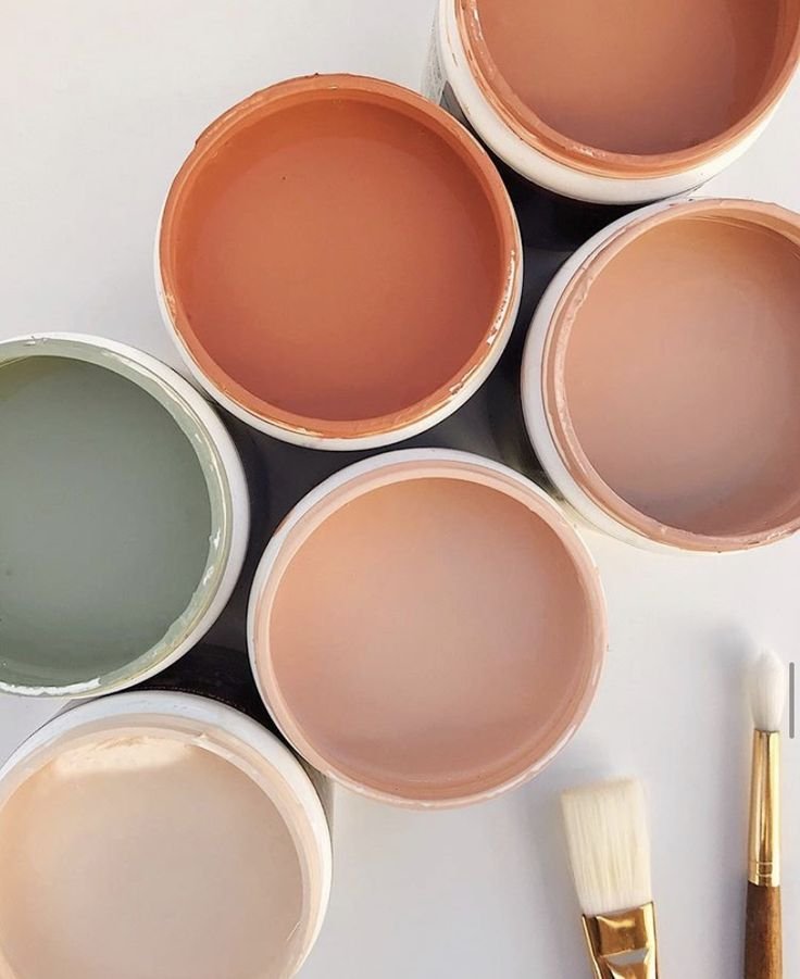
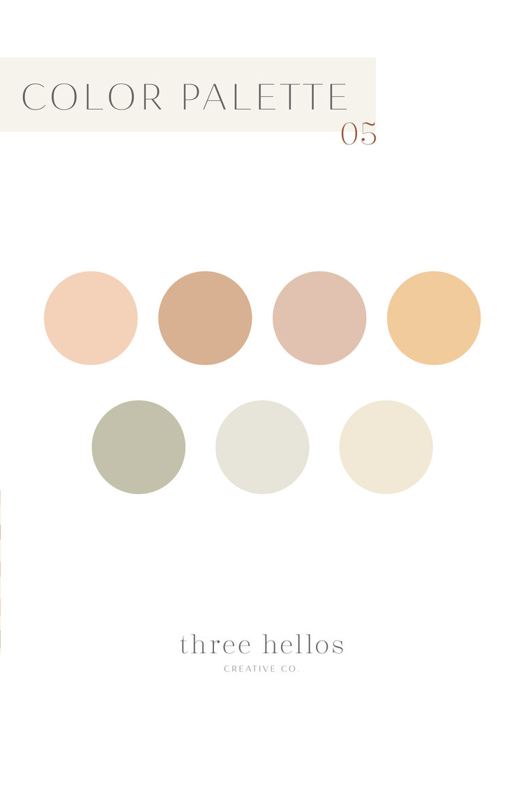
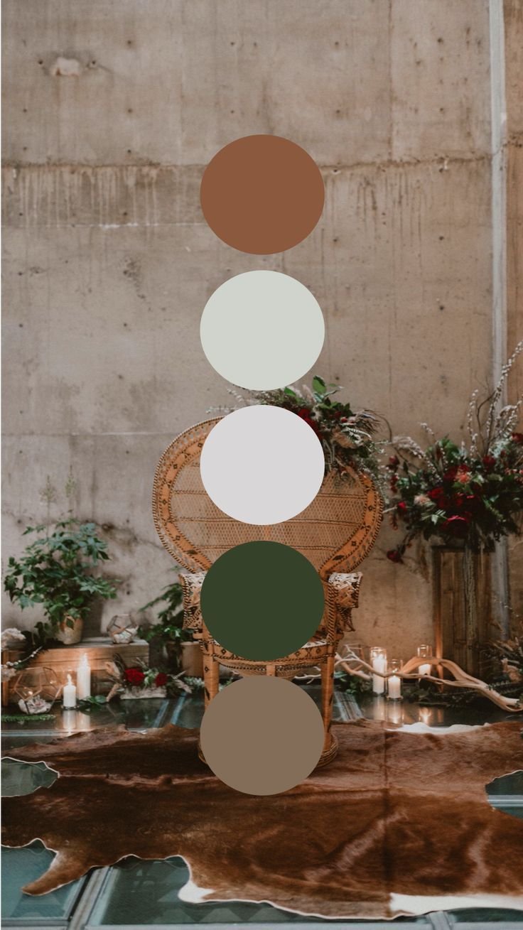
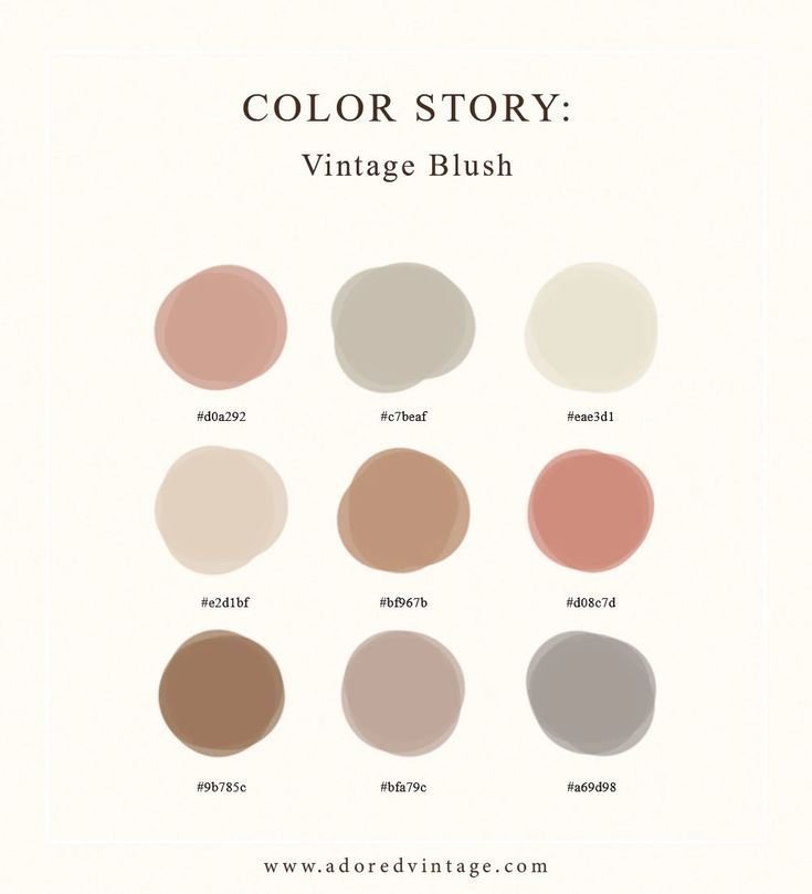
Trend #3: Color palettes
This is VERY subjective, but there are some definite color palette trends happening. Whether it’s desert tones, shades of honey, sage green, or mustard yellow, don’t be influenced if they don’t fit your brand - stay focused on your own brand goals. These really are such beautiful palettes, but unless one truly fits your brand, walk away.
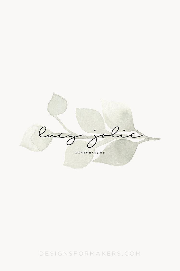
Trend #4:Watercolor swashes behind text
I’m going to be a bit harsh: this look is just plain outdated. It’s a technique that could possibly be used effectively, but I have yet to see an example that doesn’t look dated (and that works everywhere – your logo needs to be readable, resizable, and available in multiple iterations for various uses). Also, it is too busy visually, and can be difficult to digitize well without looking low-res or pixelated.
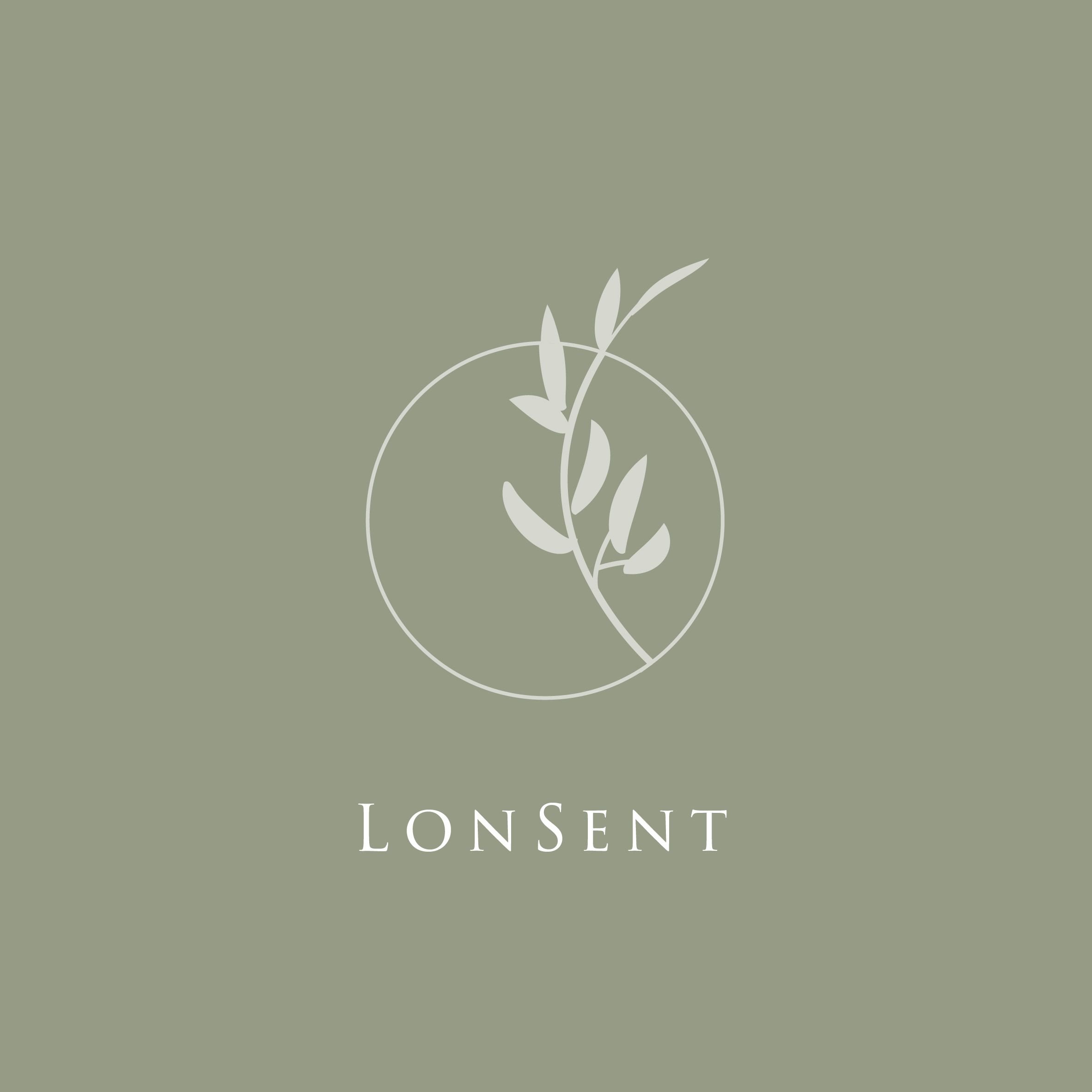
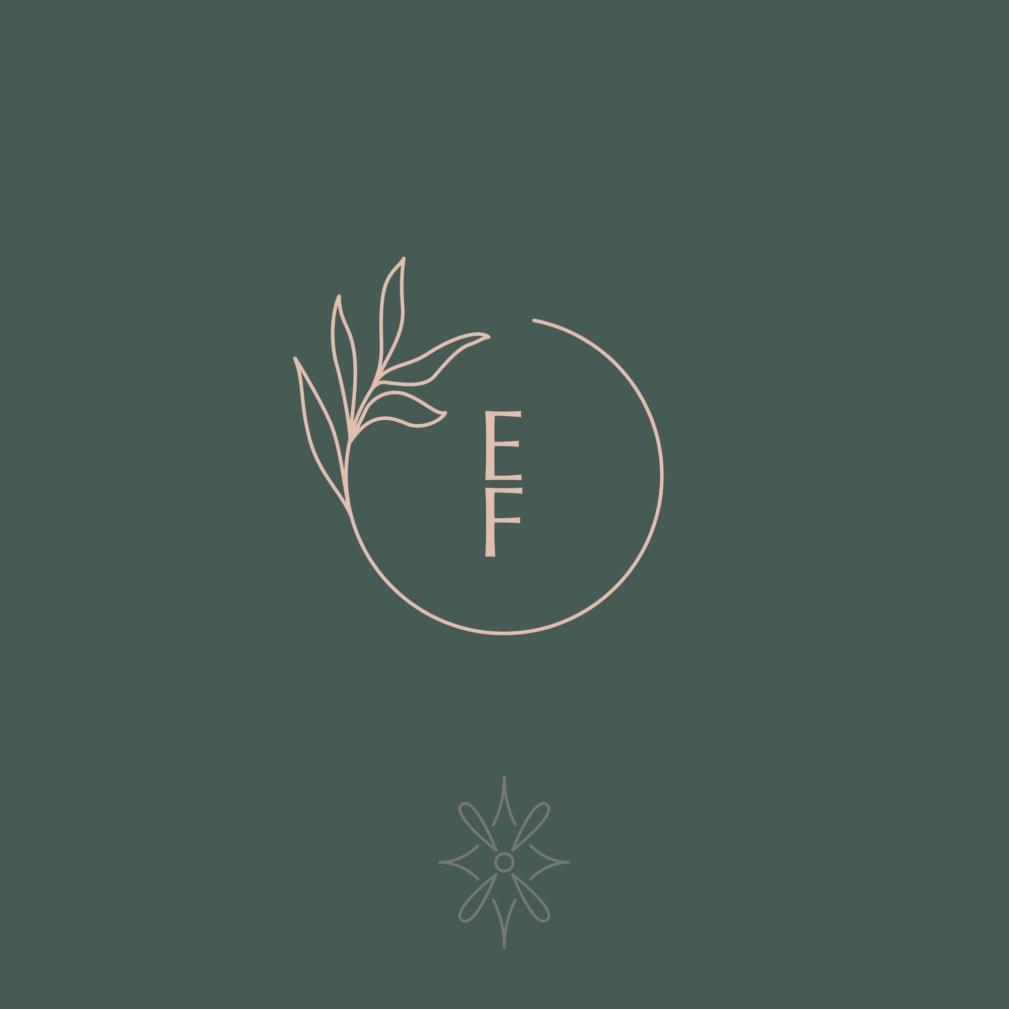
Trend #5: Leafy element, minimal text.
HEAR ME OUT. These may look familiar because this is a logo design trend that I have indeed used for some of my own clients. It is a trend that does not work for every brand, especially if you are not an organic or rustic brand with any kind of connection to the natural world. Follow with caution!
-
I always design three versions for my clients to use! As a small business owner, you’ll use your main logo the most, but it’s always a good idea to have an alternate logo for postcards, business cards, etc, and a symbol version to plug into your social media.
-
Your logo is just the tip of the iceberg when it comes to branding! The logo design is informed by your business values & goals, along with your colors, fonts, and illustrations. All of these components work together to form a recognizable brand.
-
You can read more about my process here! As a professional designer with over 10 years of experience, I follow a specific design process that is informed by my clients’ business goals & values, their joys & loves, and of course, what works best for their business type.
Okay, I’m done being a design snob! As I said above, every brand is unique and all of these are subjective. You don’t necessarily need to avoid every single design trend when it comes to developing your brand with designer, but make sure that your brand is getting the unique touch that it needs to stand out! If you look like everyone else in your industry, you will not be able to shine and reach the people you want.
A good brand designer will look past the trends, into the heart of who you are, and bring your vision to life through a unique design that will appeal to your audience and ultimately set you apart.
I am currently booking brand design clients, so if you’ve been wanting to work together, this is a good opportunity! Click below to apply!

